Ben and I are in the process of renovating our house in New Orleans, and I can’t help but think about the exterior color scheme. Everywhere you look in this eccentric city, there are colorful buildings and homes painted with bright hues, pastel monochromatics, and neutral shades. The color palette of the architecture here creates unique city blocks that are backdrops for urban photoshoots, and takes us on a colorful, rhythmic ride. With so many examples to look at, why am I having such a hard time making this selection??
“The color palette of the architecture here creates unique city blocks that are backdrops for urban photoshoots, and takes us on a colorful, rhythmic ride. ”
I love color. I have a whole Pinterest Board dedicated to it. I give as much importance to color and materiality as I do to architecture because thoughtful color adds so much. It demonstrates values. It expresses ideas and emotions. Color enriches our perception of space, the same way light and form do. I will touch lightly on the basics of color theory and then jump right into how I put together my exterior color scheme.
Color Basics
Who here has heard of the Color Wheel? I hope you ALL raised your hand. The color wheel represents the presence of light waves in color, each with a unique wavelength, as evidenced by the most magical example, the rainbow.
The Primary, Second and Tertiary colors might be the first box of crayons you ever received, making you an expert in the color wheel! But what about tint and shade? What are those?
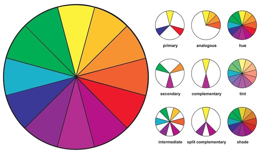
Image Via: University of Makeup

Tint: The act of lightening a color by adding white to it.
Shade: The act of darkening a color by adding black.
Tone: Slightly darkening a color by adding gray.
Saturation: The highest level of pigmentation, no change with black, white or gray.
Value: Variation in light and dark.
Color Combinations
Color combinations, or as a designer may say, color palettes or color schemes, are any combination of colors. These combinations can change the mood or tone of anything you are trying to represent from logo design to architecture.
Combinations with less contrast create a mood of restraint, subtlety, discreetness and understatement.
Combinations with more contrast create a mood of drama, excitement and conflict.
In planning a color scheme, contrast is not just created by changing the entire color, but by using the same or similar colors with different values and saturations.
Color Palette Selection
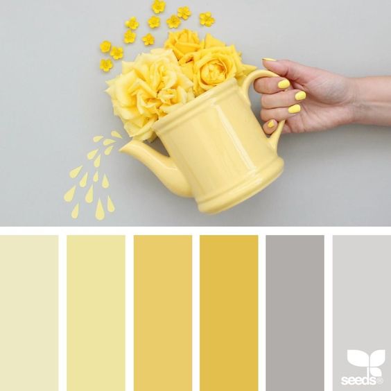
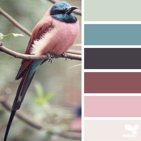
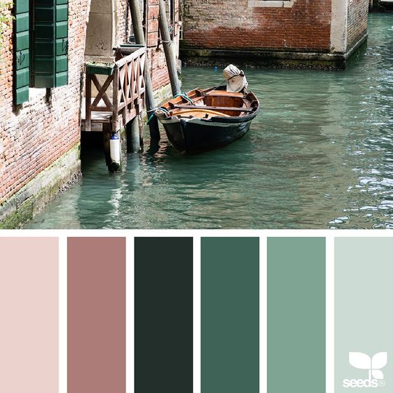
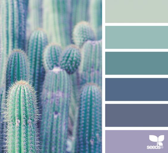
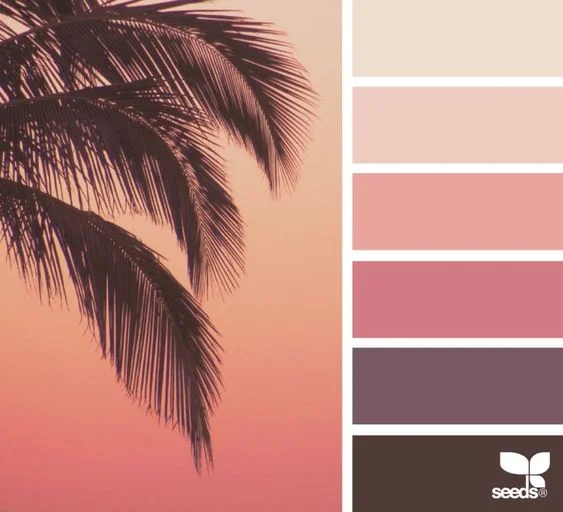
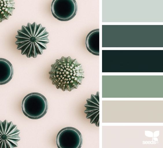
Some of my favorite color palettes are created by design-seeds.com. I found the below images on Pinterest by just searching for the term ‘color palettes.’ Here you can get palettes already generated for you, but if you are interested in exploring your own combinations of color, read more below.

Guide to an Exterior Color Scheme (New Orleans Edition):
I would stick to selecting 3 to 4 colors at most. Proper proportions are important. One color must be the dominant color, there must be a subordinate color and then an accent color or two. Think 50%, 30%, 15%, <5% ratio.
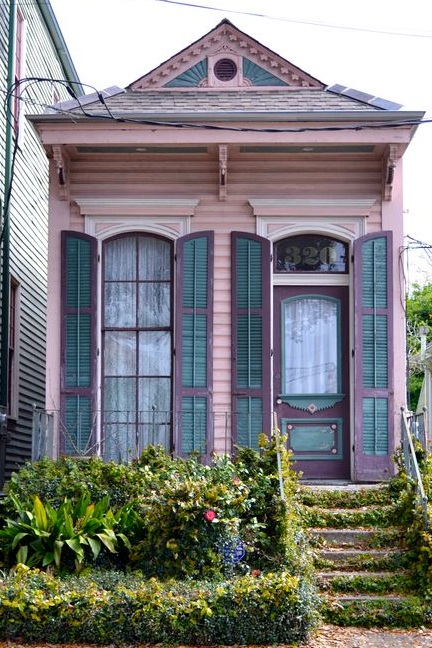
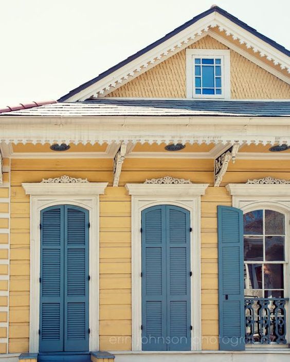
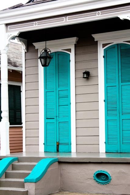
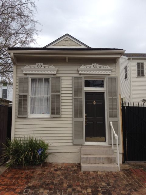
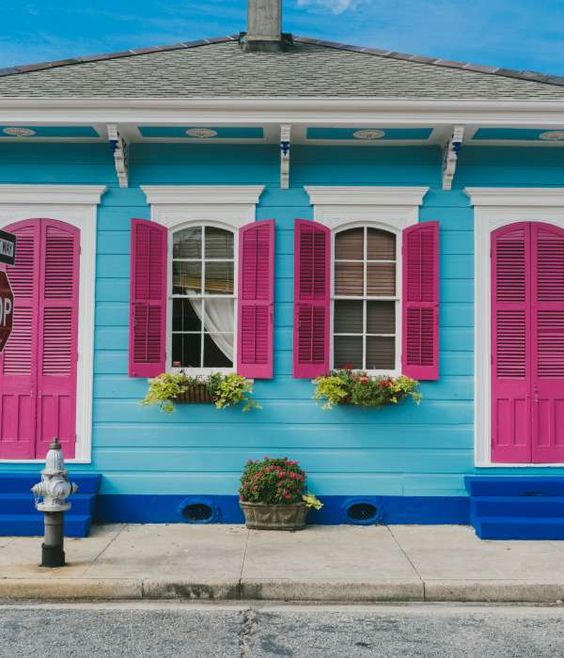
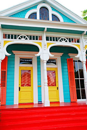
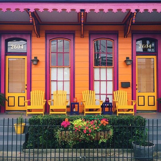
Below are some of my favorite examples of colorful New Orleans houses:
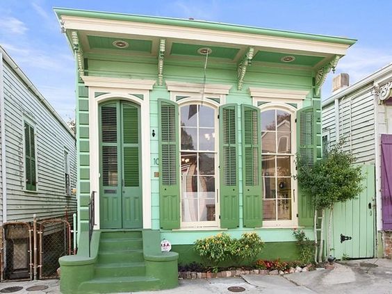
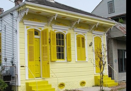


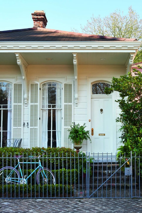
Top Row: Monochromatic, colors of varying tones, tints and shades
2nd Row: Complementary colors
3rd Row: Neutrals
Bottom Row: Vibrant, Bold colors
“I would stick to selecting 3 to 4 colors at most!”
What I know works:
For larger color combinations, select colors with varying levels of shades or tints. Your accent colors can be complementary colors. This helps your eyes find a place to rest.
When going with darker or deeper shades for siding, use white or vibrant colors to offset the dark color.
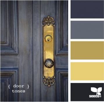
More than 4 colors almost always feels too busy. But hey, these are just my guidelines, not rules! The 4th color, the brightest/boldest color, should always be used sparingly, <5%. See: Front Door Colors above.
In Monochromatic schemes, use the darkest tone to emphasize detail for example, the shutters, doors and quoins, while the siding should be painted the lightest or most neutral of hues.
Color Combo Renderings
Below is a quick color study for our favorite residential project, our own house! We tried on a few of these principles - monochromatic with shifting values, neutrals with a vibrant color on important elements, and never more than 4 different colors. Check out our Instagram story to vote on your favorite scheme!


content source: The Complete Color Harmony, Pantone Edition by Leatrice Eiseman