I recently found a mural by @Liz_Kamarul on Sazerac Stitches door that I just loved, which got me thinking about paint and color. For someone who loves the drama of black and white palettes, I sure do obsess over color!
Punctuating with light and color on buildings’ exteriors is not a new concept, but punctuating with light and color on the interior is making its debut in a unique way.
Let’s take a step back.
How do we, as architects, punctuate with light and color on buildings’ exteriors?
Examples range from painting the front door a bright color, drawing your eye towards the building’s entrance to up-lighting columns for depth and drama.

This projected window bay pops with color in these modern townhouses in Seattle by Best Practice Architecture. Photo found on Pinterest.
How are designers using paint to punctuate on the interior?
In a world where we take photos of everything, it’s important for businesses to create “instagrammable” moments, drawing customers inside.
Designers are finding unique ways to make a big impact in an affordable way: paint!
Murals are popular on exteriors and interiors!

Photo by: New Orleans’ own Liz Kamarul (mural on Sazerac Stitches door)
Are murals the new wallpaper? Possibly! In this example on the left, the artist’s color palette and design is completely unique and matches the lighting brand’s chandelier.
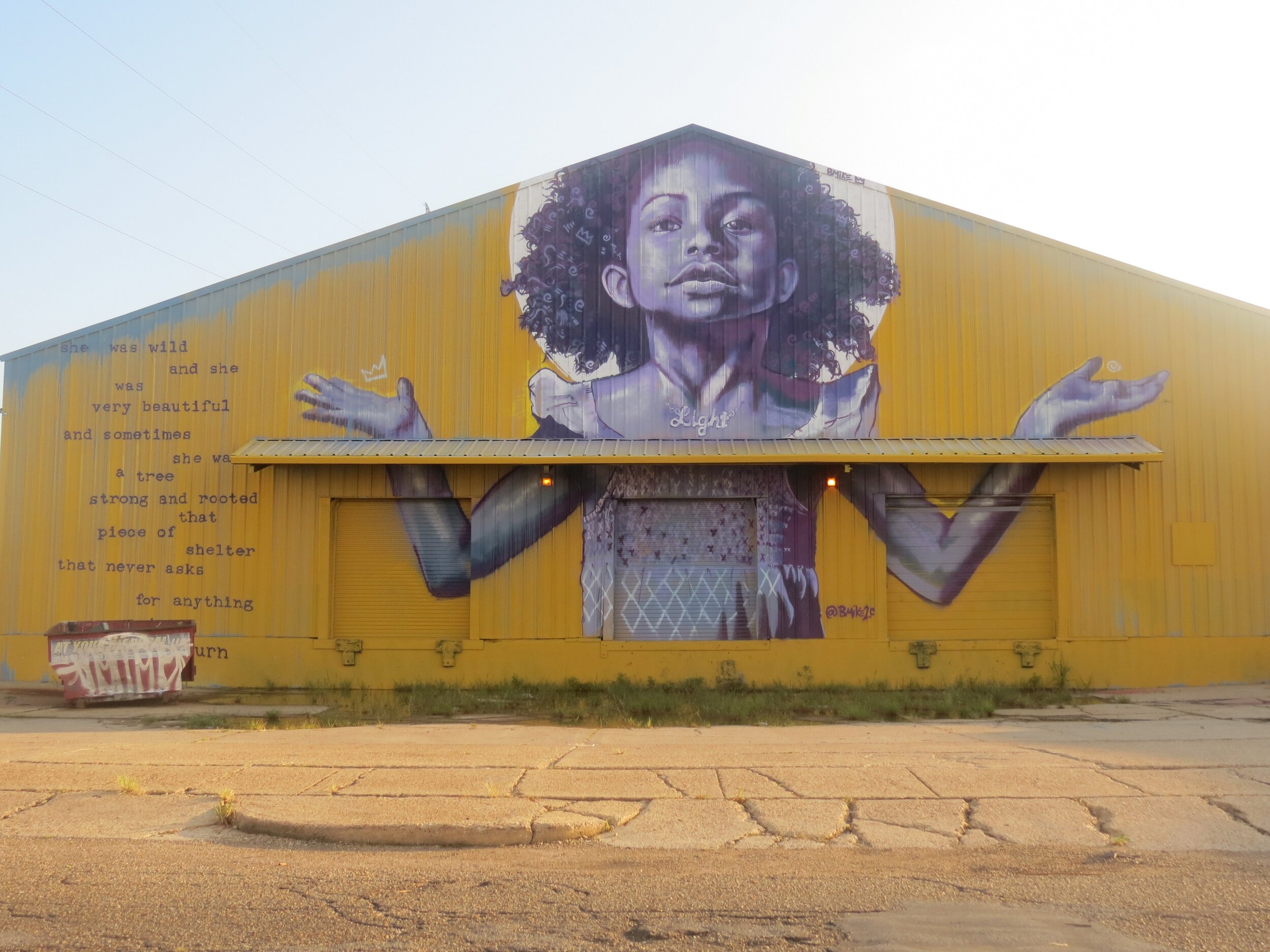
Photo by: New Orleans’ visual artist BMike, https://www.instagram.com/bmike2c/
Color Blocking with your Brand’s Color Palette!

This boutique is sporting their brands color palette which helps create a memorable and photograph-able experience. Photo by: homishome

Visual interest is created by color blocking using this homeowner’s favorite colors. photo found on pinterest
It’s Even Better On Top of Thick Moldings!
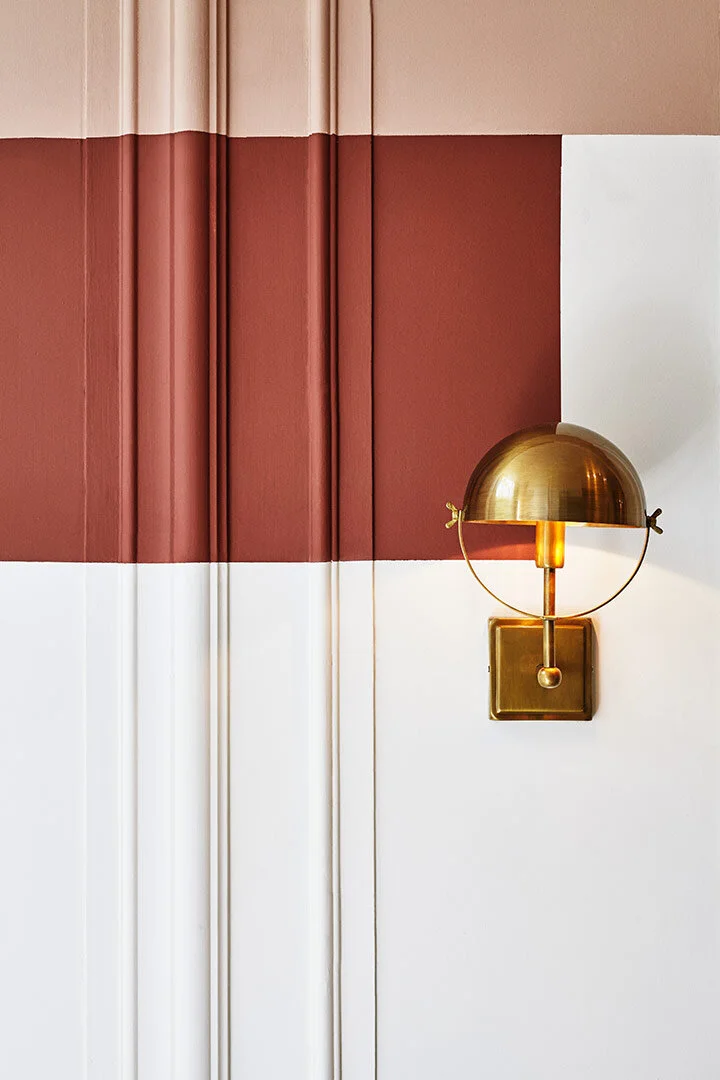
Example of color blocking over thick trim work with the Moth (SW 9174), or the African Beauty (SW 9183); photo found on: https://conexaodecor.com

Example of color blocking over door and trim. Photo found on: https://omur.gq/instagram-interiorarchitecture-architecture-design-details/
Highlight What’s Important!
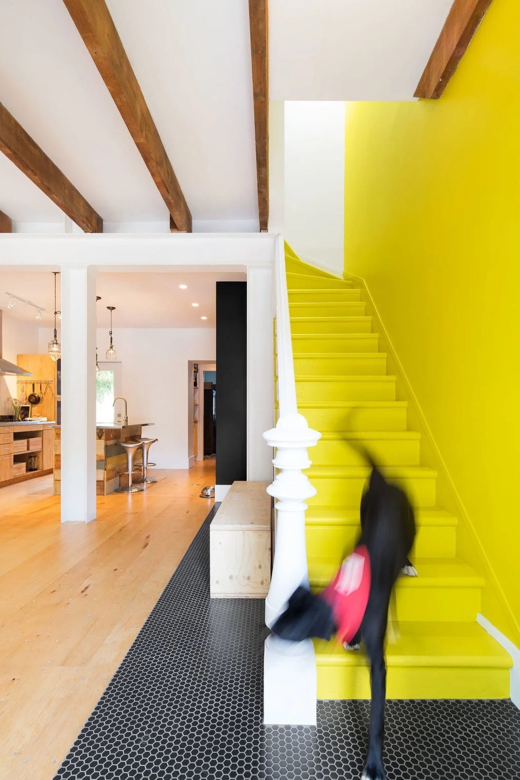
Photo found on Dwell. The designer (and homeowner) used yellow to highlight their staircase. Designer: Mark+Vivi

An example of an exterior use of paint to punctuate this store’s entrance. Photo found on Pinterest.