I wanted to blog about our latest completed project: the Lizardi Town Homes, as an opportunity to showcase some of our beautiful before-and-after photographs, but there is so much to cover, or uncover rather, with this project. Everything from the history of the building, to the owner’s discovery of the space, to our strategy in telling it's story through architecture.

Corner of Prytania and Terpsicore - BEFORE

Corner of Prytania and Terpsicore - AFTER
Growing up in New Orleans, I have always had an appreciation for the historic building stock, the layers of history and how each generation adapts these buildings to their interpretation of "modern".
The Lizardi Town Homes were built around 1836. Historians discovered that like many of the homes along the Mississippi River in New Orleans, the property was once a part of a larger plantation or estate. Eventually parceled off because of the economical pressures of downtown expansion and farming opportunities in more rural settings.

Sanborn Map showing the Lizardi Trio Town Houses
The original structures, three total at their conception, were built for the Lizardi Brothers, who were Mexican trade merchants using New Orleans as their pit stop while traveling back and forth from Mexico to Europe. Henry Laurence bought the property in 1847 and kept the property the longest until around 1970 when the property was purchased by a furniture retailer/fabricator. At this point in history, the buildings were modified into a large, single-occupancy space. At some point in history, the smallest building of the trio was demolished and the vacant lot used for parking.
The buildings’ newest owner is our client, Developer Montgomery Berman and Co.. He discovered the town homes in their most “modern" configuration with an atrium in the back. This atrium connected the once "service wings" of the main structures with a stylized, wood-and-glass curtain wall.
Walking through the building for the first time, we could see that this addition may have be installed around the 1970’s or 1980’s, when the furniture store was expanding their showroom and offices. The wood windows lacked proper flashing and were beginning to rot, and the minimal amount of new finishes applied to the atrium space were dated and lackluster. Original brick paving at the ground level remained, but was painted to match the walls.

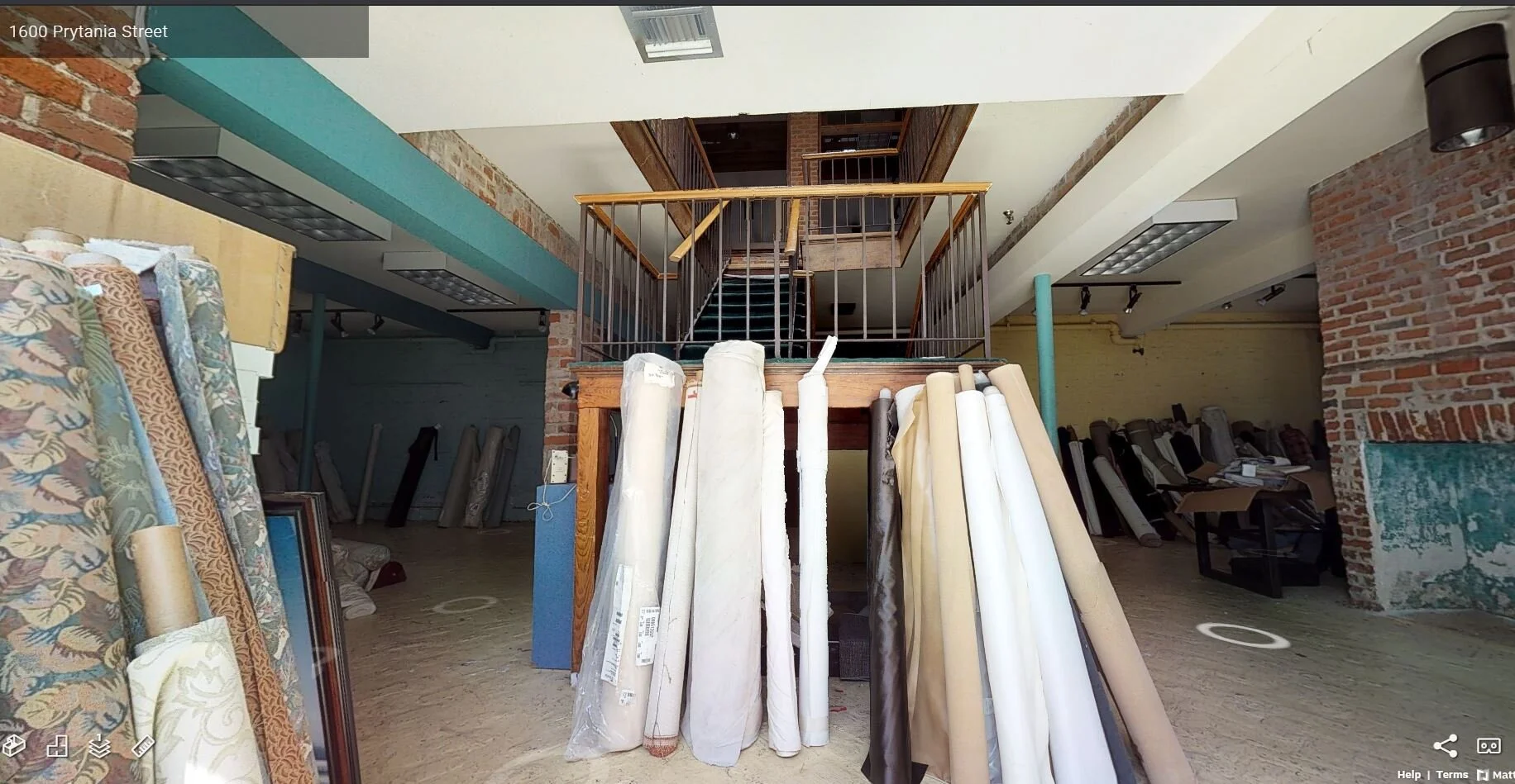
BEFORE: our client found the buildings with a two-story stair atrium enclosed with a stylized, wood-and-glass curtain wall.

BEFORE: interior views of the atrium space that was added around the 1970s or 1980s.
The main structures, now connected through brick archways, were stripped down, bare and dark. Instantly, I could visualize the Lizardi or Laurence family enjoying these rooms with their large, double-hung windows and wrap around balconies. I could see hoop-skirts, gas lanterns, and depression china. I could hear piano melodies and brass ensembles. One of the original stairs was still there, the heart pine winders and iron railing were a tactile glimpse into the past.
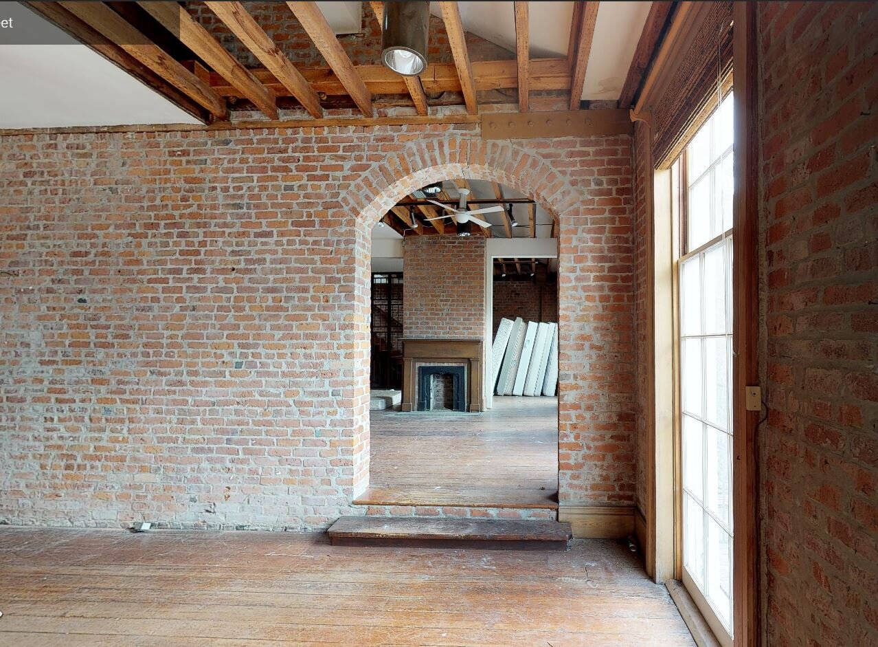
BEFORE: connected main structures

AFTER: bedroom space for one of the apartments
Our Design Strategy
With the developers approval, we proposed removing the 1970’s additions. The atrium enclosure was hiding the historic service wings. Below the service wings' balconies, we didn’t simply fill the large openings on the first floor with stucco-clad wall to match, but rather diagonal cedar planks as a gesture to the story of its modified past.
BEFORE: atrium addition circa 1970

AFTER: courtyard between original service wings
Although the original kitchens and washrooms would have been on the first floor in the service wings, our new program called for kitchen and bathrooms in the main structures. The buildings' new program required more tenant occupancy, thus resulting in four kitchens total instead of two.
One of the design strategies we used called for was modern delineation: sharp, white lines against antique brick walls. This contrast highlighted what is new and what is old. Smooth sheetrock walls abutting rough brick walls can create odd details so we painted the return side of sheetrock bead black, so that the planes appeared flush and intentional.

Original Wood lintels and transoms above historic openings were retained and repaired.

The only original door found on the property was used as a basis of design for many new doors.
Fresh coats of paint on the exterior stucco facade and gas lanterns dotting the entrances enliven the buildings' street presence. The modern railing in the courtyard was an intentional choice due to the fact that original service wing railings were shorter with balustrades further spaced apart. Fabricating these railings back to historic proportions would have been a safety concern and code issue. Instead of designing a traditional wood railing, we chose to use cable rail. Cable rail allows views to penetrate further and focus on the architecture instead of tightly space white balustrades creating visual clutter.
We chose colorful cabinets and brass accents in the kitchens. The bold colors nodding to the colorful timeline of the buildings’ history and brass complimenting the warm of the space. We tried to minimize exposed electrical conduit were we could. With exposed brick walls everywhere, we had to run electrical wires in the baseboards, so that silvery conduits were not popping up like gophers along the historic walls.

Corner Apartment - BEFORE

Corner Apartment - AFTER
With over 1,000 unique conditions, this project, for us, required constant eyes in the field. That is the difference between restoration and renovation; the difference between preservation and remodeling. What remained, untouched and creating character in the space, was left alone. What we could build back, windows and doors in particular, we did to the proportions of the original structure. We let history inform the product, in this case. We used our filter to create the story.
Project Team: Developer: Montgomery Berman & Co., Architects: Studio BKA, LLC, Contractor: NFT Group

Questions For Your Architect: Should I GC my own house project?
Can you? Yes. Should you? No. Unless you work in the construction industry and are familiar with contracts and coordination, the perceived savings of going it alone tend to evaporate quickly. While an optimistic "do-it-yourself" attitude is admirable, be mindful that these professions exist out of necessity. Take a quick test and see if you can answer 'yes' to the following questions:
1. Do I have 10-20 hours a week to dedicate to meeting with sub-contractors on site?
2. Am I tenacious enough to communicate effectively with professionals when we disagree?
3. Can I make decisions quickly and confidently?
4. Am I a good planner who remains organized from the beginning to the end of a project?
If you scored a 100, welcome to the world of construction management!
If not, a contractor could help you to save money, even though you are paying him/her 15%-20% on top of construction costs, and also consider that the contractor is saving you an immense, lengthy headache. Financially it’s generally a wash, and mentally, you are saving your sanity, which certainly has value as well!

Clients often ask me: "Can I purchase all the materials to help save on overall costs?" The answer is also yes, but let me add my two cents here. You will save on overall costs because your purchase of materials will reduce the percentage that the contractor tacks on material and labor. However, the contractor can purchase material with his/her trade discount. So where you may spend $5,000 on hardwood flooring flying solo, the contractor may pay $4200, and charge ...let's say... $840 in overhead, for a total of $5040, so you have saved yourself $40. Is it worth it to have to measure and estimate square footage and overage, coordinate the delivery, open the boxes to acclimate the wood to the moisture content of the house, and make any other preparations recommended by the manufacturer? I think most people would answer "not really". If you would do these tasks for $40 because you enjoy it, it could be time for a career switch, and again, welcome to the world of construction management!

BUT! There are some materials we do encourage our clients to purchase on their own, but be sure to review the contract with suppliers and opt for warranties. Some of those items are:
- hardware
- decorative light fixtures
- wallpaper
- appliances
- plumbing fixtures
If you need help selecting these, our interiors studio can assist with selections and pricing.For more information about my company, Studio BKA, and the many ways we can help you with your project, please check out: www.studioBKA.com! If you have any questions you'd like to see answered in this series, send me an email at kim@studioBKA.com.
Detail Hacks- The Shower Niche
A friend recently sent me a picture of this niche (shown below) and asked how the edges are generally resolved. I thought our conversation would make for a great blog post series called "Detail Hacks" since not everyone building their dream home has years of experience as an architect or builder.
The shower niche is a great detail when executed properly but unless you are a designer, architect or builder, you may overlook a couple of small things that could change the overall appearance. I will give you a few solutions and you can decide which one looks appropriate in your house!

You probably didn't think about the raw edges of the tile when you were in the tile store trying to make a decision!
Solution 1: the Schluter strip
The addition of metal gives the bathroom a contemporary vibe. The Schluter strip is essentially a transition strip that captures the raw edge of the tile.

Solution 2: Finished edge or bullnose edge
Some tile offer finished or bullnose edges that give the niche a clean look. This detail is great for traditional or modern residential projects.

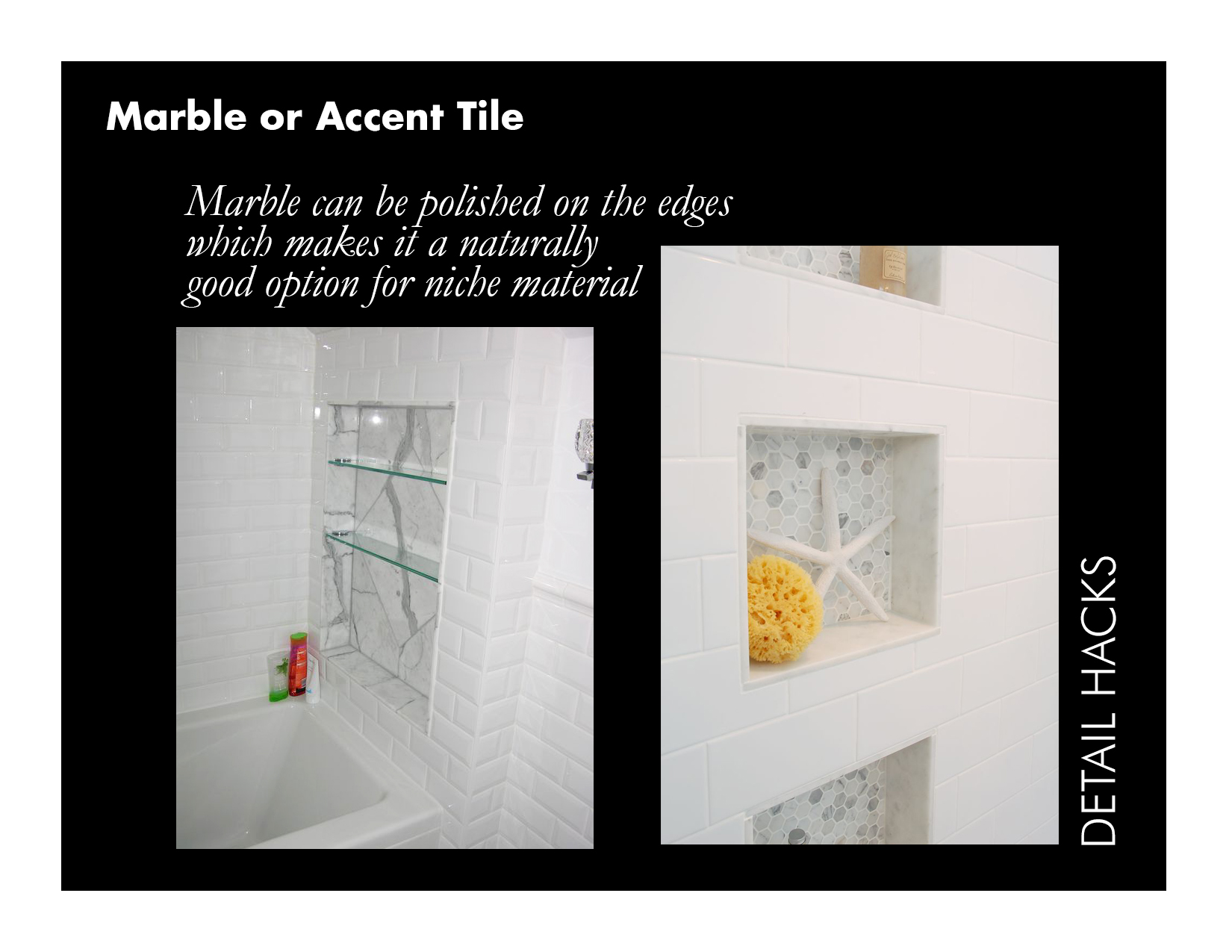
Solution 3: Marble
Let's pretend you selected a subway tile that doesn't offer finished or bullnose edges, what do you do now? One solution is to use marble or quartz as the inset material. It adds a nice contrast and its likely you have this material left over from the counter top fabrication.
There you have it! Three solution to finishing out your shower niche! Good Luck and don't forget to subscribe to our newsletter for more architecture inspiration!
Ruby Slipper Mid-City
Here's a flythrough rendering of a project we're currently working on in Mid-City, coordinating with structural, MEP and food service equipment consultants to create an information model that coordinated equipment in tight spaces, produced construction drawings and provided the zoomy experience you see here!